
A practical guide to service design in government


Teams move back and forth between these phases in reality. Discovery continues during Beta. Problems found in Live send teams back into exploration. The clean progression you see in diagrams doesn’t hold up once delivery begins, which becomes much clearer when you look at how service design works in teams.
How service design works inside teams
Service design happens inside teams that are already dealing with competing priorities.
You’ll typically find:
Service designers
User researchers
Product managers
Developers
Content designers
Policy and operational stakeholders
Each group brings its own constraints and perspectives.
Policy colleagues are thinking about legality, fairness, and risk. Their focus is: does this meet the intent, and can it be defended?
Developers are thinking about systems. Their focus is: can this actually be built, and what breaks if we change it?
An operations lead is thinking about volume and edge cases. Their focus is: what happens when this hits thousands of real users with messy situations?
Service designers and user researchers are thinking about the user. Their focus is: does this make sense, and can people actually complete it?
None of these perspectives are wrong. But they’re not aligned by default. That’s why decisions don’t come from a single place. They emerge from negotiation.
A typical conversation might sound simple on the surface:
“Can we remove this step to make it easier?”
But underneath, that question turns into:
Does policy require this check?
Can the system handle skipping it?
Will this increase risk or error rates?
Can operations deal with the consequences?
So instead of a clean yes or no, you get a set of trade-offs.
And this is where a lot of service design work actually sits. They connect evidence to decisions. They show the impact of different options. They help teams understand not just what they're choosing, but what that choice means across the whole service.
The constraints that shape everything
Public sector design is shaped by structural constraints that don’t go away. That’s because many teams are operating inside an environment that was never built for neat, end-to-end service delivery.
Organisational silos are a big part of that. Services might look joined up from the outside, but internally they’re often split across policy teams, delivery teams, operational units, arm’s-length bodies, local partners, and suppliers. Each part has its own goals, pressures, and measures of success. So one team might optimise for compliance, another for speed, another for cost, and none of them fully own the overall experience.
Legacy systems add another layer. Many government services depend on technology that has been around for years, sometimes decades. Those systems were often built for a different policy context, a different operating model, or a different view of users. They still carry critical data and processes, which means teams can’t just replace them overnight. So design decisions are often shaped by what the system can tolerate, not just by what users need.
Procurement models shape things too, often in ways that aren’t obvious from the outside. Parts of a service may be designed, built, or run by external suppliers under contracts that were agreed long before the current team arrived. Those contracts influence what can change, how quickly it can change, and who has control over key parts of the service. Even when everyone wants improvement, the commercial setup can slow things down or split responsibility in unhelpful ways.
Then there are governance processes. Public money, legal duties, accessibility, security, fraud prevention, ministerial priorities, and reputational risk all matter. That means decisions often move through governance, assurance, service assessments, and internal review points. None of that is inherently wrong, but it does mean change is rarely as fast or as straightforward as it looks in product case studies.
These aren’t temporary issues that disappear once a team gets more mature or a project gets better organised. They define the environment. They shape how work gets prioritised, who gets involved, what’s considered possible, and where compromise shows up.
Once you start looking at services through that lens, patterns emerge:
duplicated steps caused by disconnected systems
teams solving locally while the overall service gets harder to use
policies that make sense in principle but break down in delivery
frontline staff creating informal workarounds to help users get through
Those patterns are one reason challenges of designing services in the public sector feel so familiar regardless of department. The context changes, but the underlying forces are often the same.
For service designers, this is useful to understand early. It stops you treating every problem as a one-off and helps you see the deeper structure shaping the service. It also changes the role of design. You’re working inside a system of constraints, trying to make the service more coherent, more usable, and more joined up than the organisation around it naturally allows.
Designing around user needs and where it breaks
User needs are the anchor point for service design, but they’re often misunderstood.
In a lot of teams, “user needs” get reduced to a slide in a deck, a persona pinned to a wall, a statement like “users need a simple, easy experience.” That kind of thing is easy to agree with, but it doesn’t help you make decisions. Real user needs are more specific and more grounded than that. They come from evidence, not opinion.
They describe:
what people are actually trying to do (not what the service wants them to do)
what gets in their way when they try to do it
what happens when things don’t go as expected
For example, instead of saying:
“Users need a simple application process”
You get closer to something usable:
“Users need to know if they’re eligible before they spend time applying”
“Users need to understand what information they’ll need before they start”
“Users need a way to recover if they can’t complete the application in one go”
Those kinds of needs can directly shape decisions. They tell you what to prioritise, what to simplify, and where to focus effort.
The evidence behind them usually comes from multiple places:
user research (interviews, observations, usability testing)
service data (drop-off points, error rates, repeat contact)
operational insight (what frontline staff see every day)
When you bring those together, user needs stop being abstract and start becoming something teams can use to guide real choices.
But user needs don’t override everything else. A user might need a short, simple process but Policy might require multiple checks, a system might only support a fixed sequence of steps, or operations might rely on certain information being captured in a specific way.
You see this balancing act most clearly in how user needs shape government services in practice. Needs aren’t just gathered at the start and written down. They’re used continuously to test decisions, challenge assumptions, and keep the service anchored in real-world use, even when constraints make things messy.
Where services tend to fail
Failures in government services are rarely random. They tend to show up in the same places, regardless of the department or policy area.
Handoffs between teams or departments are one example. A user completes one part of a process, then gets passed to another team or system. On paper, that transition is seamless. In reality, information gets lost, duplicated, or reinterpreted. The receiving team might not have the full context, or might work based on slightly different rules. Making it feel like starting again from the user’s perspective.
Transitions between channels create similar problems. Someone might start online, get stuck, and call a helpline. Or they might be told to send documents by post after completing a digital form. Each channel has its own logic, its own limitations, and its own view of the service. Unless they’re deliberately designed to work together, the experience fragments quickly. Users end up repeating information, getting inconsistent answers, or dropping out altogether.
Issues like these are often invisible when you’re working within a single team or touchpoint. It’s only when you step back and look at the full journey that the cracks appear. The act of mapping complex government services across departments tends to surface these gaps very quickly, because it forces teams to see how their part connects (or doesn’t) to everything else.
Users with straightforward situations might get through despite the friction. They have the time, confidence, or resources to recover when something goes wrong. But for people dealing with more complex or unstable situations, those same failure points can stop them completely.
Someone managing a health condition, unstable income, or a change in personal circumstances is more likely to:
fall outside standard rules
need to switch channels
rely on support from others
struggle with unclear or inconsistent information
When services assume ideal conditions, they unintentionally exclude these users.
That’s why designing services for vulnerable and hard-to-reach users isn’t a niche concern or an add-on. It’s a way of testing whether the service works under real-world conditions. If a service only works for people who follow the ideal path, it’s not robust. It’s fragile.
What good looks like
Good service design is often quiet. It may show up as users experiencing an absence of friction. They can move forward without getting stuck. They don’t have to think about how the organisation is structured to get something done.
A good service holds together across channels. Someone can start online, switch to the phone, or get help in person without having to reset their progress or explain everything again. The service works as one, not a collection of disconnected touchpoints.
It holds together across teams. Different parts of the organisation might still own different pieces, but from the outside, those boundaries aren’t visible. Decisions made in one area don’t create confusion in another.
And it holds together across different user situations. People who don’t have all the right information, who need more time, who make mistakes, or whose circumstances don’t fit neatly into predefined rules can still make progress. The signals are rarely dramatic, but they’re consistent:
language that explains things clearly without forcing users to interpret policy
fewer, more meaningful steps instead of long, rigid processes
clear expectations about what will happen next
the ability to pause and come back without losing progress
support that’s easy to find when something doesn’t go as planned
Individually, these can seem like small improvements. But together, they change how the service feels. They reduce effort, uncertainty, and the need for users to adapt themselves to the system.
Measuring whether any of this works
Data in government is rarely clean or centralised. A single service might rely on multiple systems, each capturing different parts of the journey. Some interactions happen online, others through contact centres or face-to-face support. Pulling that together into a coherent view is not straightforward.
On top of that, outcomes are influenced by more than just design changes:
policy updates
seasonal demand
operational changes
external factors like economic conditions
So even when something improves, it’s not always clear why. Despite that, useful signals do emerge when you look in the right places.
Completion rates can show whether more people are getting through a process successfully.
Error rates highlight where users are struggling or misunderstanding what’s being asked.
Repeat contact often points to gaps in the service. If people have to call or return multiple times, something isn’t working the first time.
Operational cost gives a different perspective. A service that reduces failure demand or manual handling can improve both user experience and efficiency.
The harder part isn’t collecting the data. It’s connecting it back to decisions. Without that connection, measurement becomes reporting. Numbers go up or down, but teams don’t necessarily learn anything from it. With that connection, it becomes a feedback loop. Decisions lead to changes, changes lead to outcomes, and outcomes inform the next set of decisions. That’s where how to measure success in public sector service design shifts from being about tracking performance to understanding impact.
Conclusion
Service design in government isn’t about creating ideal services from scratch.
It’s about working within existing systems and making them better over time.
That means:
understanding how things actually work
navigating constraints that won’t disappear
and keeping the focus on the people who rely on these services, especially when the system makes things harder than they should be
Most government services don’t fail because people aren’t trying. They fail because they sit on top of systems that were never designed as a whole. Different teams own different parts. Policy sets the rules. Technology limits what’s possible. Operations hold everything together. And over time, services become something that’s evolved rather than something that’s been designed.
If you’re coming from a UX or product background, this is usually the biggest shift to get your head around. You’re not working on a product with a single backlog and a clear owner. You’re working on something where:
the front end might be one team
the backend systems might sit in another department
the policy decisions are made elsewhere entirely
and the people actually delivering the service (call centres, caseworkers) are dealing with the consequences
A simple change like “make this step clearer” can run into:
policy rules that can’t be changed quickly
systems that don’t support the new flow
operational processes that rely on the current setup
So instead of designing clean, contained solutions, you’re often working across boundaries:
understanding how decisions in one part affect another
identifying where the service breaks between teams
and figuring out what can realistically be improved now vs later
A good example is something like applying for a benefit. On the surface, it’s a form. But underneath, it involves eligibility rules, identity checks, fraud controls, manual reviews, and multiple systems passing data between each other. If one part doesn’t align, the whole experience starts to break down.
That’s why service design in government is less about designing “the interface” and more about making the whole service hang together. It’s about seeing the system, not just the screen.
What service design means in government
At its core, service design is about designing services around user needs across the entire journey, not around organisational boundaries.
That sounds simple until you look at what a “service” actually includes.
Applying for something like Universal Credit or a driving licence isn’t just a digital journey. It involves:
forms and interfaces
backend systems
call centres
caseworker decisions
letters and notifications
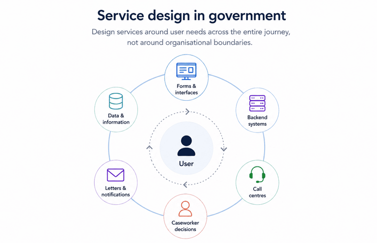
All of these parts need to work together. Most of the time, they don’t.
Part of the confusion comes from how loosely the term gets used. It often gets reduced to artefacts or workshops, when in reality it’s about shaping how the whole system behaves, which is why understanding what service design actually means in the public sector tends to be a necessary reset for most teams.
Policy intent vs real service experience
Policy describes how things should work. Services reveal how they actually work. A policy might define eligibility in a clean, logical way. It might say who qualifies, what steps need to happen, and what outcomes should be achieved. On paper, it’s structured, consistent, and internally coherent.
But the moment that policy becomes a live service, it has to pass through multiple layers:
it gets interpreted by delivery teams
translated into processes
implemented in systems
and experienced by users in real situations
That’s where things start to shift. People interpret rules differently, especially when guidance leaves room for judgement. Systems don’t always map neatly to policy logic, so rules get simplified, approximated, or hard-coded in ways that create unintended consequences. And edge cases appear almost immediately, because real life rarely fits into neat eligibility criteria.
Take something like income thresholds for a benefit. The policy might define a clear cutoff point. But in reality:
people have irregular income
their circumstances change mid-application
supporting evidence isn’t always straightforward
So what looks simple at policy level becomes complicated in practice. The service has to decide how to handle those situations, often without perfect guidance. This is where friction builds.
Users might struggle to understand what they’re being asked for. Caseworkers might have to interpret rules on the fly. Teams might introduce workarounds just to keep things moving. Over time, these adjustments become part of the service, even if they were never intended.
Designers end up working right in the middle of this. Not rewriting policy, but exposing where it doesn’t translate cleanly. Not just improving usability, but making trade-offs visible. A small change to wording, flow, or sequencing can have a big impact on whether someone completes a process or drops out.
You see this most clearly when comparing service design and policy design in government. They’re not opposing disciplines, but they operate at different levels. One defines what should happen. The other deals with what actually happens when people try to use a service shaped by those decisions.
How government services are actually structured
Most services are held together across 3 layers, but those layers are rarely visible unless you’re working within them.
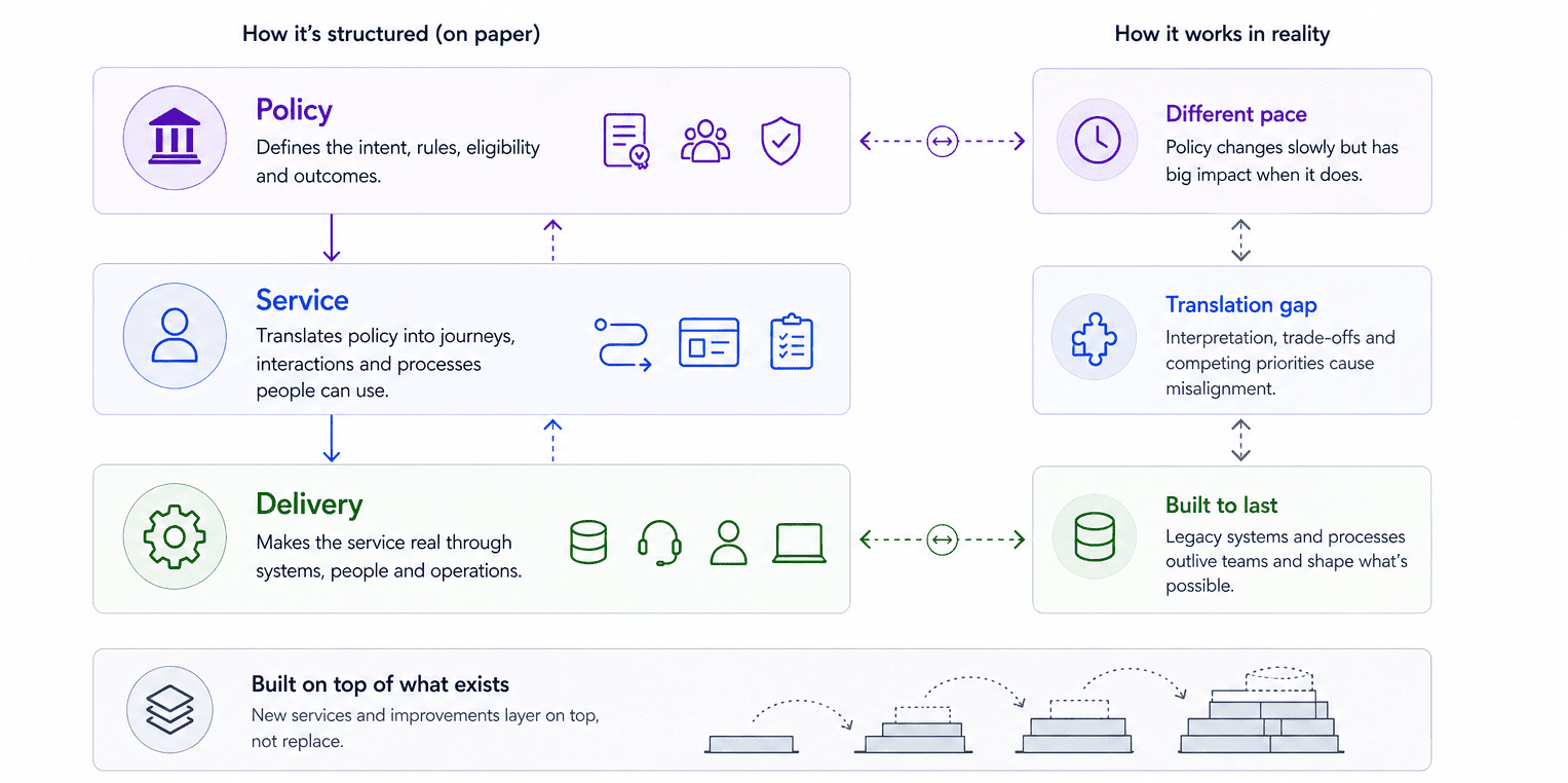
Policy defines the intent. It sets out who is eligible, what needs to happen, and what outcomes the service is trying to achieve. It’s often shaped by legislation, ministerial priorities, and risk considerations like fraud or misuse.
Service is where that intent gets translated into something people can actually use. This is the layer where journeys, interactions, and processes are designed. It’s where decisions get made about how users move through a service, what they’re asked for, and how different parts connect.
Delivery is what makes the service real. This includes the technology, the operational teams, the contact centres, the caseworkers, and the systems that process and move information around. It’s also where many constraints show up most clearly.
On paper, these three layers align neatly. Policy defines the rules, service design shapes the experience, and delivery executes it. But in practice, they drift.
Policy moves at a different pace to delivery, often changing slowly but with significant impact when it does. Systems in the delivery layer can last for years or decades, outliving the teams that built them and shaping what’s possible long after decisions were made. New services and improvements tend to get layered on top of what already exists, rather than replacing it entirely. You start to see how fragmented this can become when you look at how government services are designed behind the scenes, where a “simple” user journey often depends on multiple teams, departments, and suppliers all contributing different parts.
The result is predictable: no one owns the whole thing, but everyone influences part of it.
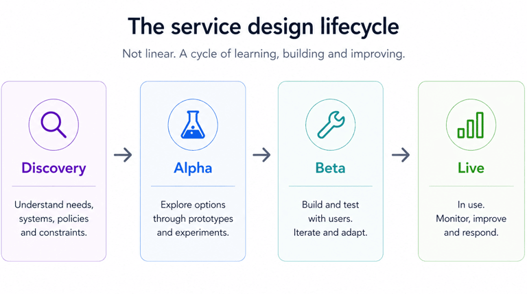
The service design lifecycle
You’ll often hear about Discovery, Alpha, Beta, and Live. They’re useful labels, especially if you’re new to government work, but they don’t reflect how work actually unfolds day to day.
Discovery is where teams try to understand what’s really going on. That means user needs, but also systems, policies, and constraints. It’s less about finding answers and more about uncovering how much is still unknown.
Alpha is about exploring possible ways forward. Teams take what they’ve learned and test different approaches, usually through prototypes or lightweight experiments. The aim isn’t to get to a final solution, it’s to figure out what might work and what definitely won’t.
Beta is where things start to become real. Services are built, tested with users, and iterated. This is also where constraints show up properly. Ideas that looked simple in Alpha can break when they meet legacy systems, operational processes, or policy requirements.
Live means the service is in use. At this point, the focus should shift to continuous improvement: monitoring performance, fixing issues, and adapting to changing needs. In reality, improvement often has to compete with new priorities, funding pressures, and operational demands.
Let's chat about your next design project.
Phone
kolawale.design@gmail.com
07826 451774
© 2025. All rights reserved.
Social