
Mapping complex government services across departments


While the method or approach to designing the map may vary, depending on the information that needs to be captured, all maps need to be validated. They need to be tested with people across the service, especially those working in delivery. Registry staff, administrative teams, and support roles will all see different parts of the process. Each conversation helps fill in gaps, challenge assumptions, and improve accuracy. The map evolves as understanding improves, and trying to get it perfect from the start usually leads to something overly simplified and less useful.
Making invisible complexity visible
One of the main purposes of mapping is to make complexity visible and that starts with handoffs. Where does the service move between teams or systems? These transitions are often where information is lost or reinterpreted. Mapping them makes those points explicit. Breakpoints and failure points are another focus. Where do users drop out? Where do processes slow down? Where do teams rely on manual workarounds? These are often hidden until they are mapped out.
The same information may be collected multiple times, or the same checks repeated in different parts of the service. Mapping shows where this happens and how it affects both users and teams. Gaps in ownership also become visible. Parts of the service may not clearly belong to any team, or responsibility may be split in ways that create confusion. Attaining this level of visibility is one of the major challenges of designing services in the public sector.
Using maps to drive decisions
The value of a map comes from using it to decide where to focus, what to change first, and what needs wider agreement before anything can move. One practical way to do this is to take the map into prioritisation discussions and use it to identify where the biggest pain points sit. That might be a handoff that causes repeated delays, a point where users drop out, or a section of the journey that generates avoidable contact. Instead of relying on opinions about what feels most urgent, the map gives the team a shared basis for deciding what should be prioritised.
It’s also useful for showing consequences before changes are made. If someone proposes a change to one part of the service, the map helps the team trace what sits upstream and downstream from it. That makes it easier to ask better questions:
Does this remove effort for users, or just shift it to another team?
Does this simplify the front end while increasing manual work in operations?
Does it solve a local issue but create a new gap elsewhere?
Used this way, the map becomes a way of stress-testing ideas before they are implemented, which is especially important in cross-department services where one team can’t always see the knock-on effects of its decisions.
Maps are also powerful in supporting business cases, funding requests, or discussions with senior stakeholders by making complexity visible in a form people can follow. Instead of saying “this service is fragmented,” you can point to the repeated handoffs, duplicated steps, unclear ownership, or failure points and show exactly why change is needed. This makes the case for investment, alignment, or policy attention much stronger. In this sense, a map is not just a diagnostic tool, It’s a working tool for prioritising action, exposing trade-offs, and helping different parts of the organisation make better decisions from the same picture.
Common mistakes
There are a few common mistakes that tend to reduce the value of mapping, and they show up consistently across teams:
Mapping the ideal future instead of the current reality. This usually happens when teams jump too quickly into solution mode. The map ends up showing how the service should work, not how it actually behaves. It may look clean and coherent, but it hides the very issues you need to uncover, which makes it less useful for diagnosing real problems.
Over-simplifying the service to make it look neat. Trying to tidy complex services up too early removes important detail, especially around edge cases, workarounds, and inconsistencies. The result is a map that’s easier to read, but less accurate and less useful for decision-making.
Creating maps that no one uses. A map that isn’t brought into discussions quickly becomes irrelevant. If it sits in a slide deck or document without being used in conversations, prioritisation, or planning, it turns into a static artefact rather than something that actively shapes the work.
Treating mapping as a deliverable rather than a process. The value of mapping comes from the process of building it, validating it, and updating it over time. When mapping is treated as something to complete and move on from, it loses its ability to reflect how the service evolves and stops being useful as a working tool.
The limits of mapping
A map can make inefficiencies, duplication, and failure points obvious, but it doesn’t give teams the authority to change them. Many of the issues uncovered sit outside the control of the team doing the mapping. They may be tied to policy decisions or governance processes that require formal approval before anything can shift. What looks like a straightforward fix on the map often turns into a much slower process involving business cases, stakeholder alignment, and multiple layers of sign-off.
There’s also a gap between identifying a problem and being able to act on it. A map might show that users are being asked for the same information multiple times, but resolving that could depend on integrating systems owned by different departments. Even when everyone agrees there is a problem, agreement on how to fix it and who should own it can take time. This is often where progress slows down.
This is also where the limits of mapping connect to wider system dynamics. The issues exposed are rarely isolated; they sit within a network of policy rules, operational constraints, and organisational structures that need to move together. Mapping can make those dependencies visible, but it can’t resolve them on its own. Real change happens when the map is used to bring the right people into the conversation and create the conditions for decisions to be made across those boundaries.
How the system actually holds together
Mapping complex government services is about building enough shared understanding to make better decisions. Services become more visible when they are mapped and that visibility makes it easier to see where problems originate, how they connect, and what might change them. It also reinforces the need to think end to end.
In most government services, what looks like a single service to a user is usually spread across departments, agencies, systems, and teams, each responsible for a different part of the journey. A user might move from one department to another or from an automated process to a manual decision without ever seeing those boundaries. Internally, those transitions are shaped by policy rules, system limitations, and organisational structures that have evolved over time. There is no single source of truth that explains how everything fits together, which means most teams work with partial views of the same service.
Mapping in this context is about making this fragmented system visible. It involves uncovering how user journeys connect to internal processes, how data moves between systems, and how responsibilities are distributed across teams. The goal is not to simplify the service on paper, but to understand how it actually behaves in reality, including where it breaks down. This requires pulling together evidence from different sources, validating it with the people who operate the service, and accepting that the picture will always be incomplete. Done properly, mapping becomes a way to see beyond individual touchpoints.
Why cross-department services are so hard to understand
Cross-department services are difficult to understand because they were never designed as a whole. They’ve evolved over time in response to policy changes, funding decisions, and operational pressures. New processes are added, systems are layered on top of existing ones, and responsibilities shift between teams.
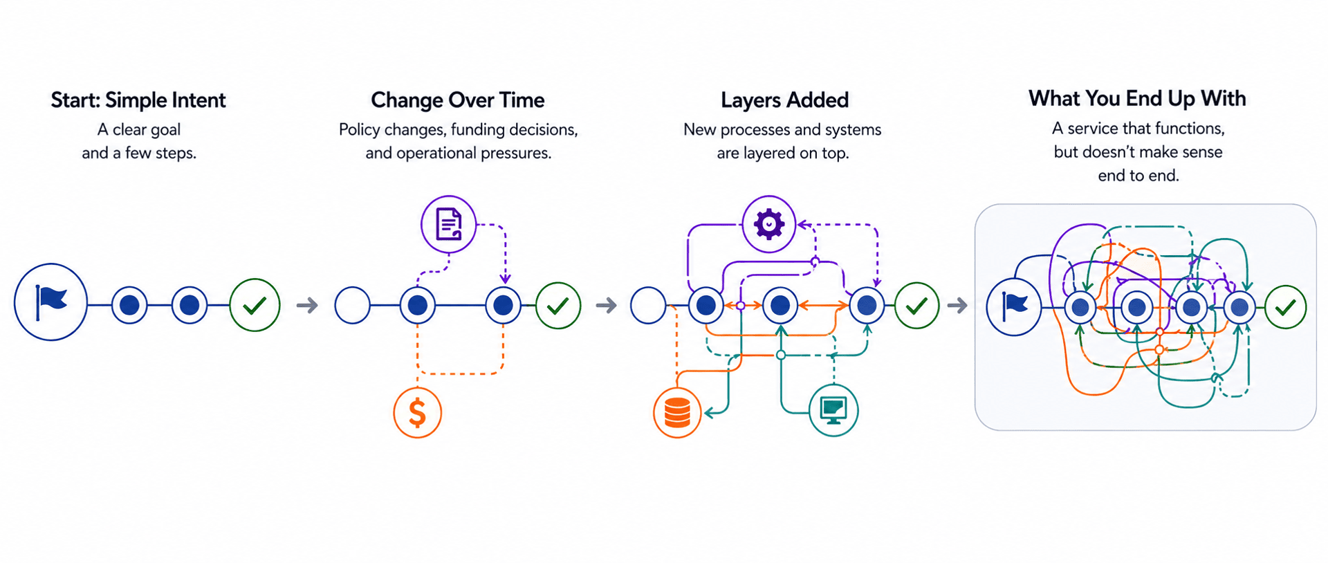
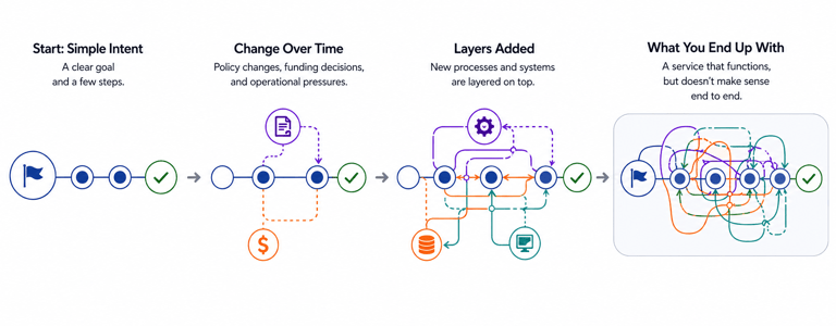
What you end up with is a service that functions, but doesn’t necessarily make sense when viewed end to end.
Each team sees a different version of the service:
Policy teams see rules and intent
Delivery teams see systems and constraints
Operational teams see volume, edge cases, and workarounds
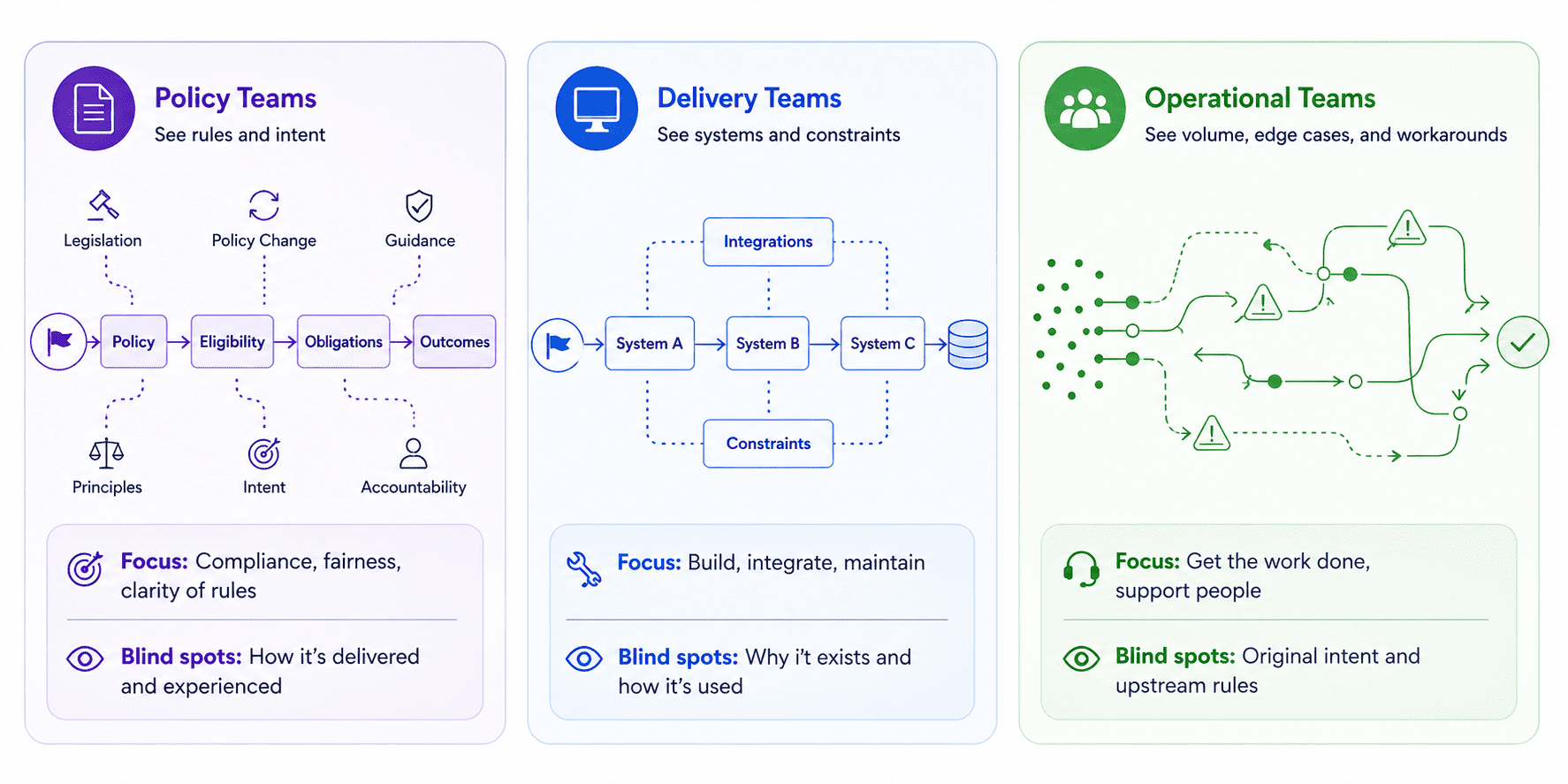
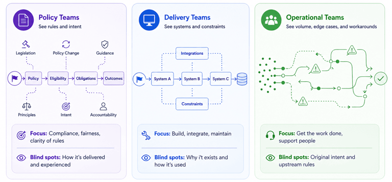
These perspectives are all valid, but none of them provide a complete view. This fragmentation is representative of the underlying structure seen in how government services are designed behind the scenes, with what appears to be a single service actually operating as a network of loosely connected parts.
What you’re actually mapping
Mapping a complex government service is about understanding the system that produces a journey. The visible steps a user takes are only the surface. What you’re really trying to uncover is how those steps are created, how they connect, and what sits behind them. A journey map on its own can show what happens, but it doesn’t explain why it happens that way, or what is shaping it. Without that deeper view, it’s easy to mistake symptoms for causes and design around the wrong problem.
Beneath the surface:
Internal processes define what needs to happen behind each step, including checks, approvals, and handoffs.
Decision points determine how users move forward, often based on rules that are not visible to them.
Systems and data flows control what information is captured, where it is stored, and how it moves between different parts of the service.
Teams and ownership boundaries show who is responsible for each part, even when that responsibility is unclear or shared.
These elements don’t operate independently, they influence each other continuously, often in ways that are difficult to see without mapping them out.
Across all of this, policy and rules cut through the system, influencing what is possible at every stage. They determine what evidence is required, how decisions are made, and where flexibility exists or doesn’t. These rules are embedded within it, interacting with processes, systems, and people. The result is a system where layers overlap, intersect, and sometimes conflict, creating complexity that isn’t obvious from the outside. Mapping, in this context, makes the complexity visible so that teams can understand how the service actually works.
When and why mapping is used
Mapping is used at different points for different reasons. In Discovery, mapping helps teams understand the current state. It exposes what is known, what is assumed, and what is missing, often revealing that the service is more complex than expected, and that key parts are not yet well understood.
In Alpha and Beta, mapping becomes a tool for alignment. It helps teams explore how the service could change, identify dependencies, and test whether proposed improvements hold together across the system. It also creates a shared reference point, so teams are not working from different assumptions.
In Live, mapping is used to diagnose issues. When something isn’t working, maps help trace where problems originate and how they propagate through the service. They also support continuous improvement by showing how changes affect the system over time. This kind of ongoing use reflects the same principles outlined in what service design actually means in the public sector, treating mapping as a part of something that evolves, rather than a one-off activity.
How to actually build a cross-department map
The starting point is not the organisation. It’s a user goal.
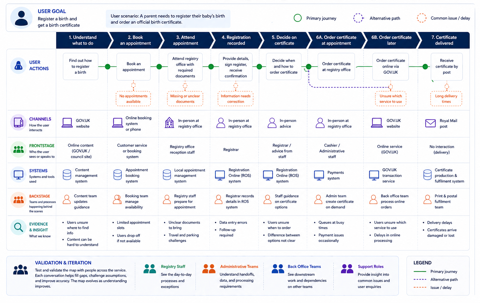
Choose a specific scenario, something concrete. For example, registering a birth and ordering a birth certificate. From the user's view, this looks like a straightforward interaction with a local council but internally it involves booking an appointment, attending in person at a registry office, having details recorded into a national registration system, and then potentially ordering certificates either at the appointment or later through a separate service. Starting with a clear user goal like this keeps the mapping grounded and avoids drifting into something too abstract or organisation-led.
From there, pull in evidence. User research can reveal confusion around booking appointments, uncertainty about what documents to bring, or misunderstandings about what happens after registration. Operational insight from registry staff highlights where delays occur, how errors are corrected, and how edge cases are handled, such as late registrations or missing information. Existing documentation, such as GOV.UK guidance or local authority process notes, provides a baseline, but often misses how the service actually behaves day to day. Bringing these sources together helps build a more complete picture.
Map what happens today, not what should happen. In practice, someone might book online, attend an appointment, realise information is missing, and then have to follow up later through a different channel. They might order a certificate at the registry office, or later via GOV.UK, triggering a separate process handled by a different team. These kinds of variations and workarounds are part of the real service and need to be captured, even if they don’t appear in official process descriptions.
Then start layering in detail. Add channels to show how users move between online booking, in-person appointments, and follow-up interactions. Add systems such as the Registration Online system used by registrars, and any local systems used for appointment management. Add teams, including local authority staff, registry office workers, and back-office processing teams. This layering reveals how the service actually operates and where dependencies sit.
Let's chat about your next design project.
Phone
kolawale.design@gmail.com
07826 451774
© 2025. All rights reserved.
Social