
Designing services for vulnerable and hard-to-reach users
The challenge here is making sure they work together as a single system. For example, a user might start online, get stuck, call a support line, and then be directed to an in-person appointment. If those channels are not connected, users end up repeating information or restarting processes. This creates unnecessary friction, particularly for users already under pressure. This is also where assisted digital support becomes important because it acknowledges that some users need help completing digital journeys, because the context they are in makes it difficult.
Flexibility vs consistency in real systems
Standardisation helps ensure fairness, consistency, and efficiency. It reduces variation and makes services easier to manage at scale but too much rigidity can exclude users whose situations don’t fit the expected pattern.
Flexibility allows services to handle complexity, but it can introduce inconsistency or operational burden. The design challenge is being able to decide where flexibility is necessary and where consistency is essential. This balance is often shaped by policy constraints, operational capacity, and risk considerations. This is also where service design connects directly to policy intent. The space between what is designed and what is possible rests within the gap between policy intent and service reality.
Working with frontline staff and support networks
Caseworkers, call centre agents, and advisors often bridge the gap between formal processes and real user needs. They help users interpret rules, recover from errors, and navigate systems that are not always intuitive. In many cases, these roles become informal designers of the service. They develop workarounds, provide additional explanations, and fill gaps that the system does not cover. This makes them a valuable source of insight into where services break down.
Designing well in this context means treating frontline staff as part of the service ecosystem. Their experience is often one of the most reliable indicators of where users struggle. And in situations where delivery pressures are evident, they serve as an alternative solution to gathering actionable insight, pending a more extensive discovery.
Measuring impact for vulnerable users
High completion rates do not necessarily mean the service is working well for vulnerable users. Some of these users may be struggling silently, repeating steps, or relying heavily on external help. More meaningful signals include repeat contact, drop-off at specific points, and patterns in support requests. These indicators often reveal where users are struggling even if they eventually complete the process.
Qualitative insight is essential as well. Understanding why users fail or struggle requires listening to their experience, not just tracking their outcomes. This shift in focus is crucial in understanding how to measure success in public sector service design, by reframing measurements around understanding impact rather than just performance.
Common mistakes teams make
Several patterns show up repeatedly when services struggle with vulnerable users, and most of them come from designing around an assumed “typical” user rather than real variation in need.
Designing for the average user is one of the most persistent. A service built around average assumptions might work smoothly for someone with stable housing, clear documentation, and uninterrupted time, but the moment someone’s situation becomes less predictable, the design starts to fail. The result is not always total breakdown, but slow friction, extra steps, repeated contact, and increased reliance on support channels that were never designed to carry that load.
Also, when accessibility is treated as a compliance requirement, the focus tends to shift towards meeting minimum technical standards rather than understanding how people actually experience the service. This may mean a service passes accessibility checks but still relies on complex language, unclear sequencing, or assumptions about digital confidence. In real use, this gap shows up as users abandoning tasks halfway through or needing assistance for steps that are meant to be self-service. The service is technically “accessible,” but practically still difficult to navigate without support.
Non-digital journeys create a similar problem when they are treated as secondary pathways. Phone lines, in-person support, and assisted digital channels are often designed as fallback options rather than integrated parts of the system. This separation creates inconsistency. Instead of a connected experience, the service becomes a collection of disconnected routes that require users to carry information between systems themselves. This is especially problematic for people who are already under pressure, managing multiple constraints at once, or not comfortable repeating traumatic experiences they've had.
Finally, oversimplification of complex needs tends to create the most misleading outcomes. Simplification looks like clarity, reduced steps, fewer decisions, and streamlined journeys. But when complexity is removed rather than designed for, the service stops reflecting reality. Edge cases are pushed out of scope, exceptions become informal workarounds, and frontline teams absorb the gaps. Over time, this creates services that look efficient in design artefacts but rely heavily on human intervention to actually function in practice.
Why this matters
Designing for vulnerable and hard-to-reach users is a test of whether a service actually works. It exposes gaps between intention and reality, between policy and delivery, and between systems and lived experience.
When these gaps are addressed, services become more resilient and inclusive. The work shifts from optimising for the average case to designing for real conditions and in public services, that difference determines whether people get what they need when they need it.


Designing for vulnerable and hard-to-reach users is where public service design stops being abstract. These are users dealing with financial stress, health issues, unstable housing, disability, or sudden life changes. When interacting with public services, these users also don’t have the luxury of opting out. If a service is difficult, they can't just switch providers. They struggle through it or rely on others to help them. That’s why failure is not neutral in this context. It has real consequences:
delayed support
missed deadlines
or people simply dropping out of processes they still need
This is also where understanding how user needs shape government services becomes critical, because it shifts the focus from assumed behaviour to actual lived conditions. When services work well for the most vulnerable users, they tend to work better for everyone. Not because everyone has the same needs, but because the design has been forced to handle complexity, uncertainty, and constraint rather than assuming ideal conditions.
What “vulnerable” and “hard-to-reach” actually means
Vulnerability is not a fixed category. It can be situational, such as someone dealing with bereavement, sudden unemployment, or a health crisis. It can also be long-term, such as disability, chronic illness, or limited digital literacy. What matters is not the label, but how these conditions affect someone’s ability to navigate a service.
“Hard-to-reach” is often misunderstood as a user problem, but in most cases it is a service problem. It usually means the service is difficult to access through the channels provided, or that the design assumes a level of stability, access, or understanding that doesn’t exist for everyone. People are not inherently hard to reach, the system is often hard to use in certain contexts.
This distinction matters because it changes where responsibility sits. Instead of asking why users are not engaging, the more useful question becomes where is the service creating friction?
Where services fail vulnerable users
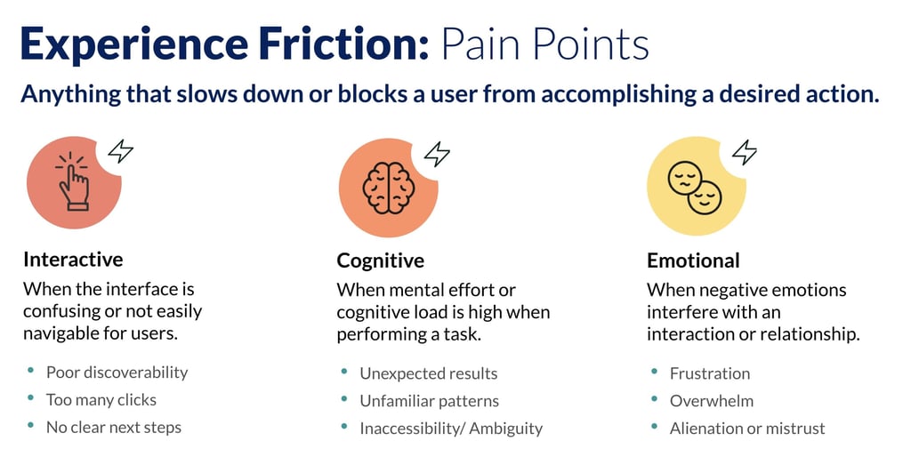
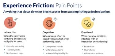
Failure tends to accumulate through small frictions that become barriers over time. One of the most common issues is complex language and unclear instructions. When users are under stress, even small ambiguities can lead to errors, delays, or abandonment. What feels precise internally often becomes inaccessible externally.
Rigid processes are another failure point. Many services are designed around standard cases, with limited flexibility for exceptions. But vulnerable users are more likely to fall outside these standard patterns. For example, someone without stable documentation or consistent address history may struggle to pass verification steps that assume continuity.
Digital-only design also creates exclusion. When services assume users can complete everything online, they overlook people who need assisted support, phone guidance, or in-person support. This is not just a channel issue. Channels that don’t work together create fragmentation, which is part of the wider problem present in how government services are designed behind the scenes. Fragmentation across departments increases cognitive load. Users are often asked to repeat information, navigate different systems, or understand which part of the service they are interacting with. Each step may be reasonable in isolation, but together they create unnecessary effort.
Understanding real needs beyond the “average user”
Traditional user research can miss vulnerable users if it relies too heavily on convenience sampling or assumes stable engagement. The people most affected by poor service design are often the least likely to appear in standard research panels. This creates a blind spot in understanding how services behave under real pressure.
Good practice requires widening how insight is gathered. This may include working with support organisations, charities, or community groups who already help people navigate government systems. This is something that some government organisations already do quite well. It can also mean designing research methods that account for interruption, stress, or partial participation, rather than expecting ideal conditions.
In some cases, proxy research can be used, speaking to frontline staff who regularly support users rather than directly accessing users themselves. This is not a replacement for lived experience, but it helps fill gaps when direct engagement is difficult.
Designing for real-world conditions, not ideal journeys
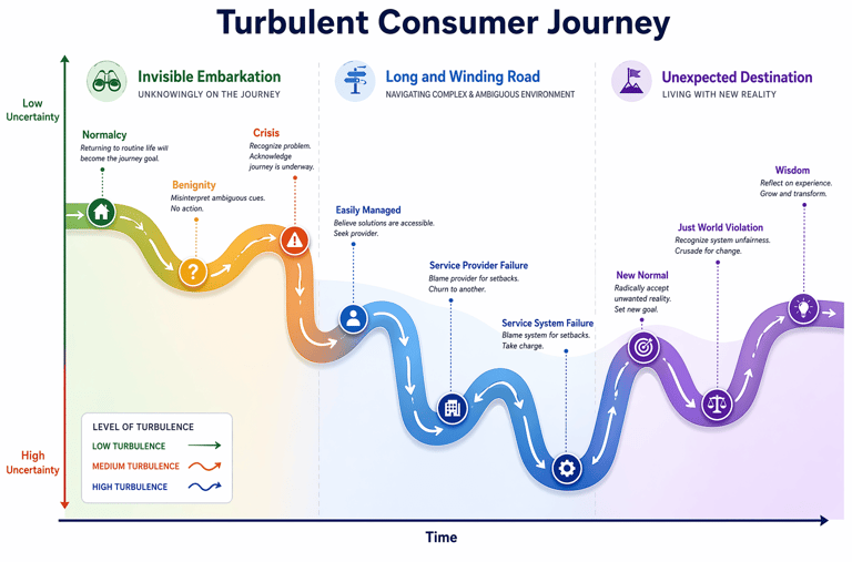
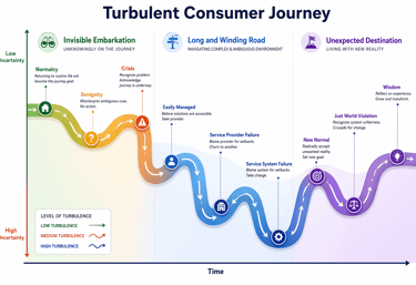
Vulnerable users rarely move through services in a single sitting. They may need to pause, gather information, seek help, or return later. Services that assume linear completion tend to fail under these conditions. This is why reducing cognitive load becomes essential.
This means fewer steps, clearer instructions, and less reliance on memory. It also means designing services that allow users to recover from mistakes without starting again. This often matters more than adding new features or improving speed. Users may not have access to documents, consistent contact details, or digital tools at the point of need. Services need to account for this variability rather than treating it as an exception. This is where complexity becomes visible in a very direct way, connecting back to the structural issues of designing services in the public sector.
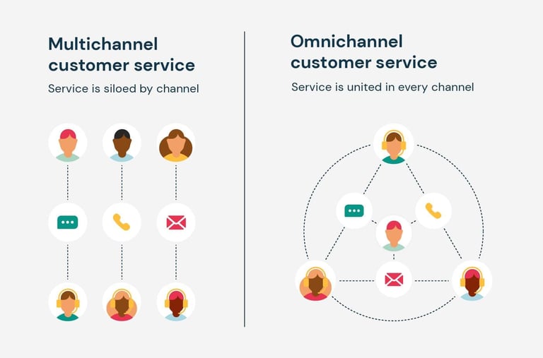
Omnichannel design as a requirement, not an option
A common misconception is that digital services replace other channels. In reality, effective public services rely on a mix of digital, phone, face-to-face, and assisted digital support.
Let's chat about your next design project.
Phone
kolawale.design@gmail.com
07826 451774
© 2025. All rights reserved.
Social